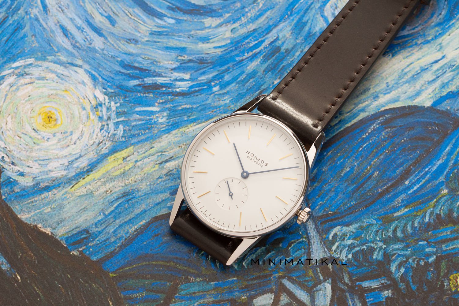
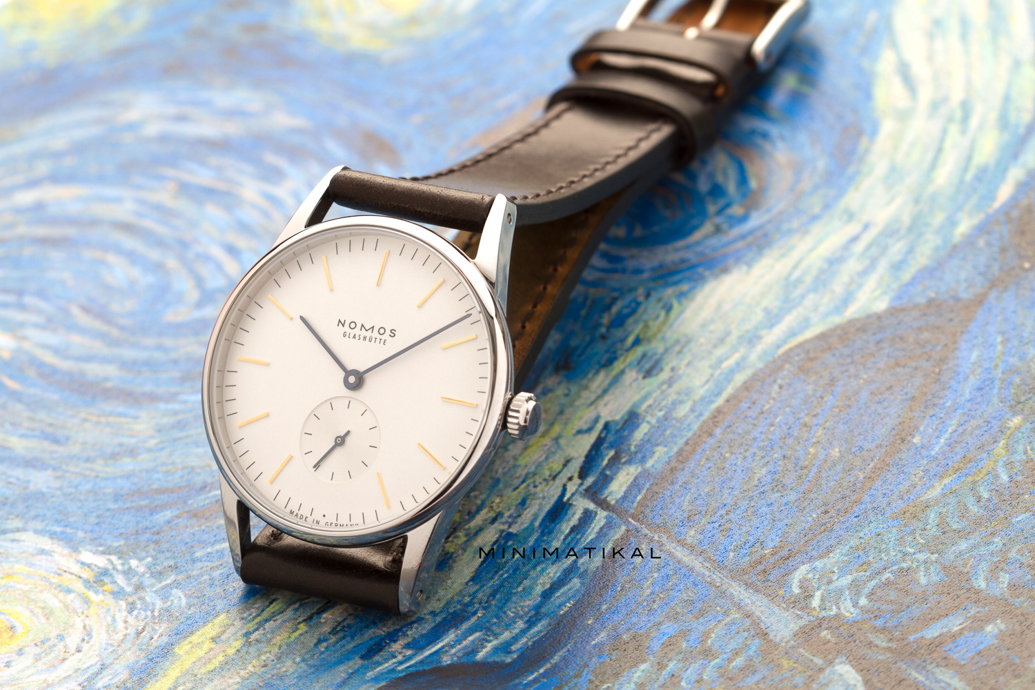
Orion 309
There’s a reason why the Orion is a favorite among the Nomos design team. The dial is clean and has just enough information to make it an easy to read timepiece.
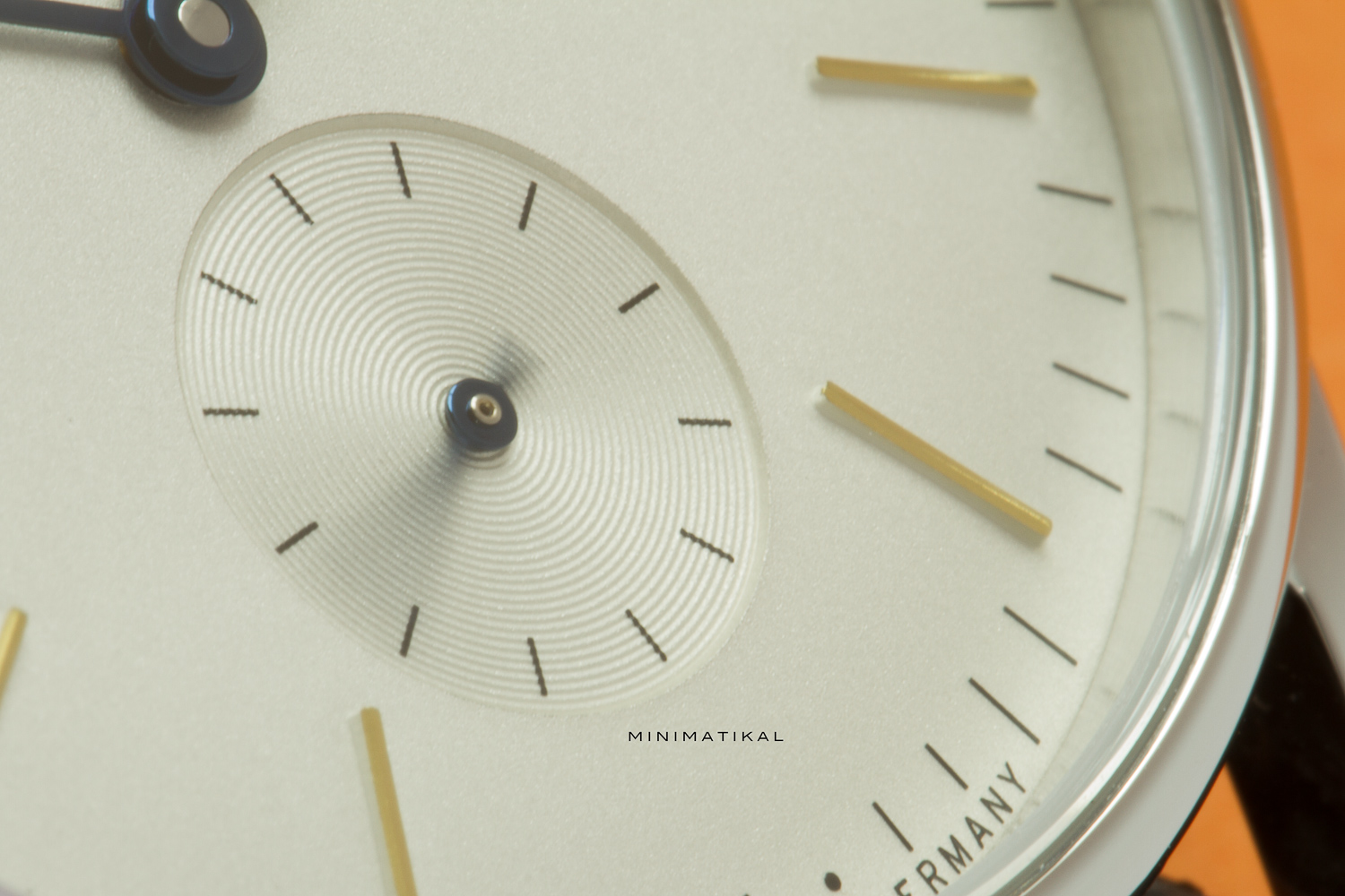
When creating a new design, a designer will usually begin working in black and white, especially when it comes to graphics. Color is something that one can play with later. That is exactly what the Nomos design team has done with the Orion. The minute markers are thin stripes that aren’t too invasive, yet still very legible. The hour markers are perfectly balanced in between the minute markers. They decided to go away with every fifth minute marker, as that is where the hour marker comes in. This was not an unconscious decision. Form must follow function, and the Orion is a perfect example of that. Nomos makes the Orion in many color combinations; a good dial design can be pulled off in many different color combinations.
I wear the Orion myself, so I have to admit that I may be slightly biased when writing this post. Sure, I can imagine that to some people, the dial may seem a little empty. I respectfully disagree. The Orion is pure, it’s clean, it’s strikingly beautiful without demanding too much attention.
The Nomos Orion 309 has always been a favorite of mine. It’s yellow index and cyan blue hands are harmoniously balanced like a Mondriaan painting. While perfectly balanced, the color combination actually reminds me more of another famous Dutch artist. If you are reading this, take a visit to the Van Gogh museum the next time you find yourself in Amsterdam. In the museum you will see the same cyan blue hands juxtaposed with bright yellow. Look at obvious paintings like Starry Night, Cafe Terrace at Night, and then maybe less famous paintings such as Wheatfield with Crows, and you will see the connection.